
Wednesday, 7 March 2012

Tuesday, 6 March 2012


Monday, 27 February 2012
Sunday, 26 February 2012
Saturday, 25 February 2012
Friday, 24 February 2012
evaluation question 4
evaluation quesion 4
by: media12345
this is the type of music that my target audiance will be interested in.
http://www.youtube.com/watch?v=1G4isv_Fylg&ob=av2e
by: media12345
this is the type of music that my target audiance will be interested in.
http://www.youtube.com/watch?v=1G4isv_Fylg&ob=av2e
Thursday, 23 February 2012
Wednesday, 22 February 2012
Tuesday, 21 February 2012
evaluation question7
through doing this task i have learnt how to make my magazine look like an actuall magazine by using good colours this was because i reasurchd magazines and i allso learnt how to make my own colours on photoshop.i allso have become allot better on the sedinghs because i now no how to use diffrent tools in order to make my magazine look good i have learnt how to crop and reshape things to.i now no how to take really good and clear images that are relevent to my genre that will attract people to so overall i have learnt allot of new skills.
Monday, 20 February 2012
print screens of my front cover

i added all of my coverlines with the text tool i used a special effect on the text tool to make the inportand parts stand out i also added a bar across the bottom of my magazine using the shape tool so then i could write over the top .i used my artist on the front because she lookd moody and keen she looks like she knows music and she also looks really indie.
photoshop tools helped me to make the artist look more indie and more fearce as i got a clossser picyure by using the zooming in tool and i allso cut her hat out and put ti over the top of the leters

i then added the word AMY JONES with a quote underneath this is my artist and it makes people want to buy the magazine to read whats inside i made this stand out because i added a drop shaddow by cliking on the layers at the side witch then brought special effects up that i could do to the text. the photoshop text tool let me resize the word amy jones in order for it to stand out and it allso let me keep editing it to make it look really bold and strong.

i then added a sighn saying exclusive i did this by using a shape block and using white text to make it stand out over the top i then used another shape witch is a circle and placed a smaller ohne inside this is a graphic with makes the text look like it is cumming of the page it makes it stand out.

this is my finished product i added a really large masthead that stood out i used the text tool and i also used capitall letters so it really stood out .
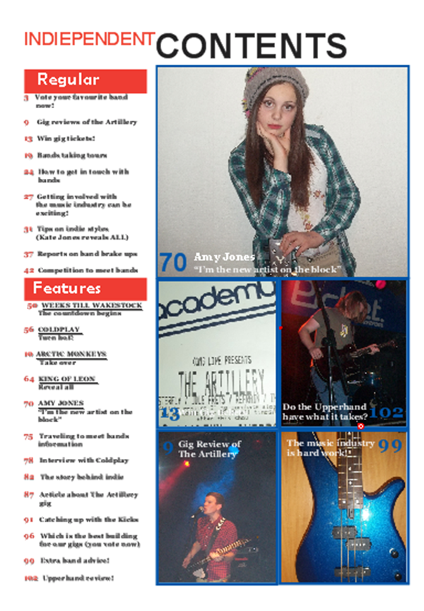
print screens of contents

i added collumbs to split my page up this made the page look allot more orgonised.
i did this on quark and it let me seperate the text i had to create the layout when i first set up the document i allso used text boxes to create text layers this allowed me to move the text to were ever i wanted it on the page.

i then decided to change the layout and then add some pictures with the text box and picture box tools this let me insert pictures and text and let me put them were i wanted to allso was able to change and add other pictures by inserting a picture box that allowed me to import documents.

i then added quotes to put with my pictures because this will make people understand why the pictures are here and will make them want to find the information inside.i allso then added all my regular and feature content this made my contents page look more full.

i then added my title with the text box i changed the font a few times so i could see witch one fitted and looks good with the pictures, and then added numbers this made the contents look really good and i allso made my contents page look allot more orgonised and it allso made my conents page look like a real one but i was still missing one picture.

so i got the last picture of my artist and used it this is my finished contents.
overall i think my contents page looks like a real contens page and i think it would fit into an indie usic magazine genre and i think allot of people would buy it ....
print screens of dps

i added my picture of the upper hand playing live by inserting a picture with the picture box then i imported the picture from my documents then i edited it to make it strech and become allot bigger i allso did my article on microsoft word and then pasted it in to a text box on quark.i was able to do this by adding a new layer of text.

i then added quotes and made them colourfull to stand out and look allot more interesting.i did this by cliking on the text tool and edited the text on the tool bar at the bottom of the page i hen pu them ino my tex but i had t be curfull were about i put them as i had to make sure tha they fited in and i also had to make sure that they looked good to.

i then made my own font in photoshop by using text and shape blocks and saved it as a jpeg and then inserted a picture and added it in . i made my own font to make it unique and so it was my own idea although it took along time to do i think it was worth because i think it looks really good and it fits with the indie genre.

this is my finished double page spread. i think it looks realy good and dits in with the indie genre.
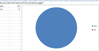
audiance feedback
i asked 10 people to fill out an evaluation about my front cover contebts page and doublepage spread i also took a voice clip of one person answering it.


Yes no


these are the written questions i asked
Front cover
1. How old are you?
2. What gender are you?
Male female
3. Do you think the magazine front cover looks like an indie magazine such as uncut?
Yes no
4. Name an indie music magazine my front cover is similar to if any?
..........................................................................................................................
5. Do you think the front cover looks eye-catching if so what do you like about it?
...........................................................................................................................
6. What do you think could be better about the front cover?
...........................................................................................................................
7. What age group do you think the magazine will appeal to?
............................................................................................................................
8. Do the cover lines want to make you read this magazine and witch is your favorate?
Yes no
9. Do the colour schemes go well together?
Yes no
10. Does the layout interest you in anyway if yes how?
Yes no
Contents page
1. Do you think the colours look good together?
Yes no
2. Do you think the pictures look clear?
Yes no
3. Do you think that the pictures go with the indie genre?
Yes no
4. Do you think the pictures go with the articles?
Yes no
5. Do you think this looks like an actual contents page?
Yes no
6. Do you like the layout of the contents?
Yes no
7. Which would be the top 3 articles you would like to read?
...........................................................................................
...........................................................................................
...........................................................................................
8. What do you think could be made better on the contents page?
............................................................................................
Double page spread
1. Do you like the layout?
Yes no
2. Do you think the picture is clear?
Yes no
3. Do you like the font of the title?
Yes no
4. Do you like the positioning statement on the double page spread?
Yes no
5. Do you like the layout of the double page spread and if yes what do you like about it?
...............................................................................................................
6. Do you think the main image matches the article ?
Yes no
Subscribe to:
Posts (Atom)